
FORD
ONLINE ACCESSORY CATALOGUE
Responsive screen design and shop content for an online accessory catalogue

Details.
Redesign of the new Ford online accessory catalogue. A responsive webshop with a CMS system, so that the markets have the possibility to enter local offers into the system, which covers more than 40 different markets, each with its own individual trading structures and operating in 42 languages. https://shop.ford.co.uk/
Responsibilities.
Conception & information architecture
Creation of Wireframes and art assets
Creation of styleguide and style tiles
Prototyping (Click Prototypes)
Coordination with Programmers
Project Management & Client presentation
Duration.
2017
10 months
Ford online accessory catalogue.
The new Ford Online Accessory Catalogue (OAC) is online: http://www.ford-zubehoer.de/
It has been a long process and I would like to take this opportunity to review the workflow
which I have used to implement such a large project. In general I have used the following process for the implementation:
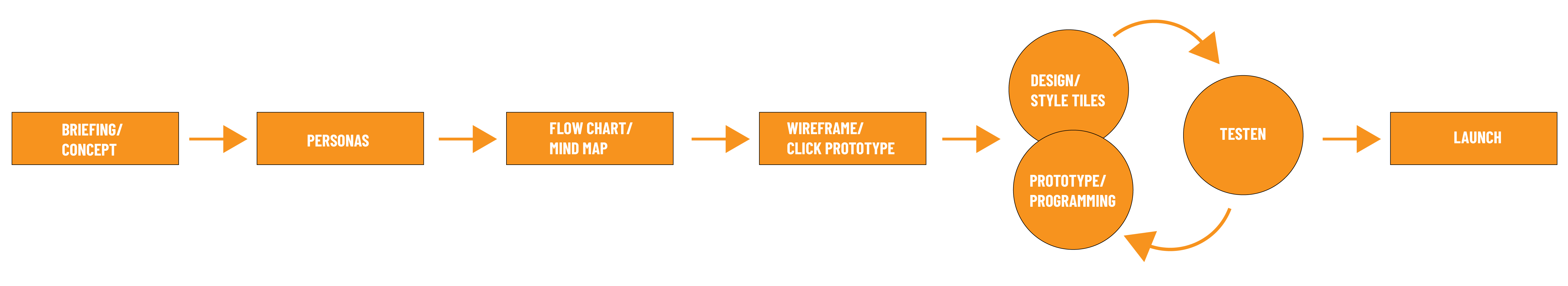
I recommend choosing an agile process for digital conversions, with clearly defined sprints to avoid cost- and time-intensive loops and ensure a good workflow

Phase 1: Briefing/concept.
ReDesign of the Ford OAC: The task was to redesign the previous Ford OAC online presence using Ford's new style guide.
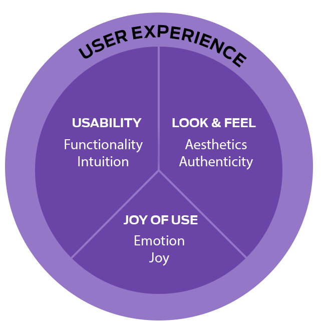
Important factors were in the following: Easy accessibility, simple and intuitive use of the catalogue, lower click rates and a high conversion rate. In short, creating a good user experience.
First I analysed the previous online presence. From this, a number of areas for optimisation already emerged. First of all, there should be a prominent and simplified search function, based on successful shop systems such as Amazon or Zalando. Furthermore, the entire content structure, such as article previews, is to receive a new layouting structure and visual hierarchy. A major deficit of the „old“ shop architecture was that the user was "forced" to make a vehicle selection - in the form of a pop-up - even if he only wanted to look at articles that are independent of a vehicle type. Therefore, my measure to ensure a better user experience and usability was to remove this selection in order to guarantee the user a simple and quick entry to the articles and therefore to the shop pages. So there was no "blocker" for the user to dive deeper into the website and the customer can select the vehicle at any time on the shop page.
The visual aesthetics were supported by prominently displaying the vehicles and their articles by giving them screen space for their presence. The website was implemented according to the mobile first principle, as well as the approach of the "atomic design“ approach (division of the design into its smallest components). The other breakpoints for tablet and desktop resolutions were taken into account and clearly defined and designed in the layouts and their style tiles.

Phase 3: Flow chart/ information architecture.
Based on the brief and concept ideas, an information architecture was created to determine the strucutre and the number of the entire screens and how they are linked together.
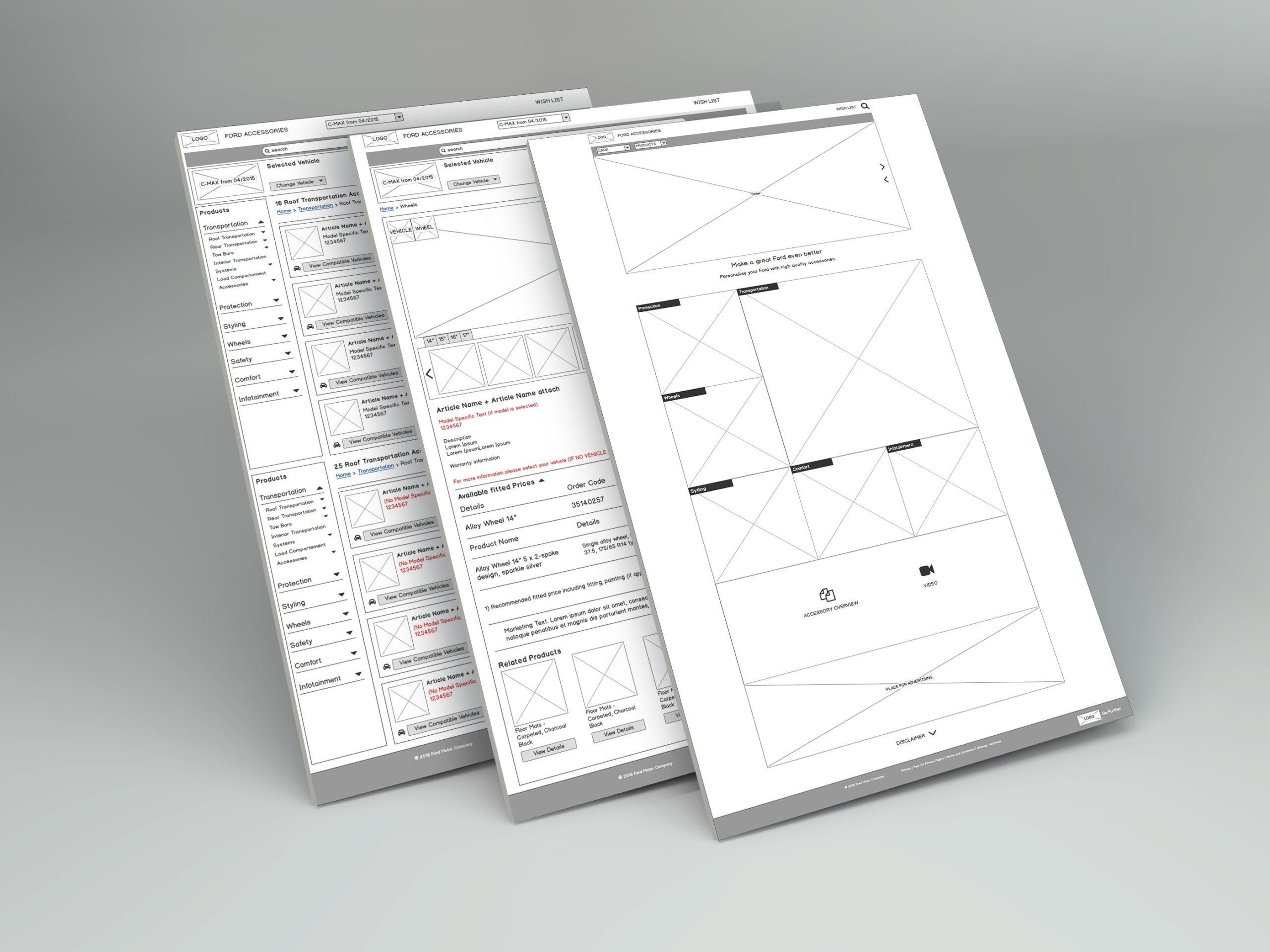
Phase 4: Wireframe creation.
In the next phase, wireframes - based on the architecture - were created. The focus here was to create the basic structure and to display, which information should be presented and to convey ideas as quickly as possible. To create hypotheses and test them to evaluate whether they are valid or not.
This makes it possible to quickly present first approaches and ideas to the team and client and to evaluate whether the client and developer share the same vision. Further iterations can be carried out in the form of workshops.
The wireframes were created with balsamiq, but other tools can also be used as well, for example Sketch, InVision, Adobe XD, Figma etc. or the creation of simple paper prototypes. Since I have created individual UI elements into modules, I was able to adapt them for other devices such as tablet or mobile devices. It is important to consider responsiveness already in this phase and develop wireframes for the individual breakpoints.
Here is a wireframe example of the landing page (desktop):
With the architecture defined and wireframes created, the next step was to combine those wireframe screens by linking those individual screens with each other and export it as an interactive PDF click prototype. This made it possible for us as developer and for the client to test the interaction structure early on, in particular to check important and essential usability and UX factors. For example, whether the navigation structure feels intuitive and easy to understand. Is the user in control and does he know how to reach his goals and is he always in control. Have important factors of user experience design already been considered and recognised? The next step is then mainly targeted on the look and feel in the design phase.
Phase 5: Implementation, design/style tiles.
After the wireframe phase has been approved by the client, we proceeded to the implementation phase.
The entire implementation process was kept very agile and iterative, in which entire screens or only certain elements are first created visually, programmed and then being tested. This ensures that certain adjustments or corrections can be implemented quickly and, ideally, that there are no large loops that can be time-consuming and costly.
The wireframes were the foundation for the visual quality. At first a framework with a 12-grid system was set up to implement the screens pixel by pixel to also simplify and serves the programming for the technical implementation.
Using the Ford CI and its style guides, I used Photoshop for the graphical implementation and created the individual screens. Due to the large number of screens I categorised them according to content and divided them into individual psds. I did the same for the other two breakpoint layouts (mobile and tablet). Here is an example of the conversion from wireframe to visual look:

During development, I also created a project style tyle, a digital style guide that documents exactly the use of the elements, i.e their dimensions, what statuses there are, how they are animated, etc.
Prototyping and programming.
Afterwards I created a digital prototype with proto.io based on the pdf click prototype and the screen designs to present this to the programmers and to the stakeholders. This serves as a very good example on how the different responsive breakpoints (desktop, tablet, mobile) behave. Proto.io is particularly suitable for mobile design, as it also allows it to be tested directly on mobile devices.

Testing.
We successfully implemented the website, including intensive testing, especially how the website is displayed in different web browsers such as Google Chrome, Mozilla Firefox, Microsoft Edge and Internet Explorer, as well as various tablet and mobile devices.
To test the website on different resolutions, it is worthwhile to have a look at the website Screenfly, which simulates and test your website on different screen sizes.
Launch.
In the coming months, other markets will also be activated after the localisations have been carried out for them and their content has been released and integrated.
After projects in general, I like to do post mortems, to evaluate how the project went in terms of time and quality and what learnings can be drawn from this to make the next project more effective and better. But also how the team and each individual employee experienced the journey to implementation. What is their input? What should be improved, where were the deficits? And what was positive, what should be continued.
The Ford online accessory catalogue was successfully implemented in quality, time & budget, which was well received by the stakeholders, team and very importantly, by the customers as well.
Selected Works

PredecessorGame Development User Experience Design
Avatar - Frontiers of PandoraGame Development User Experience Design
Need for Speed UnboundGame Development User Experience Design

Need for Speed HeatGame Development User Experience Design

Football EmpireMobile Game development User Experience Design
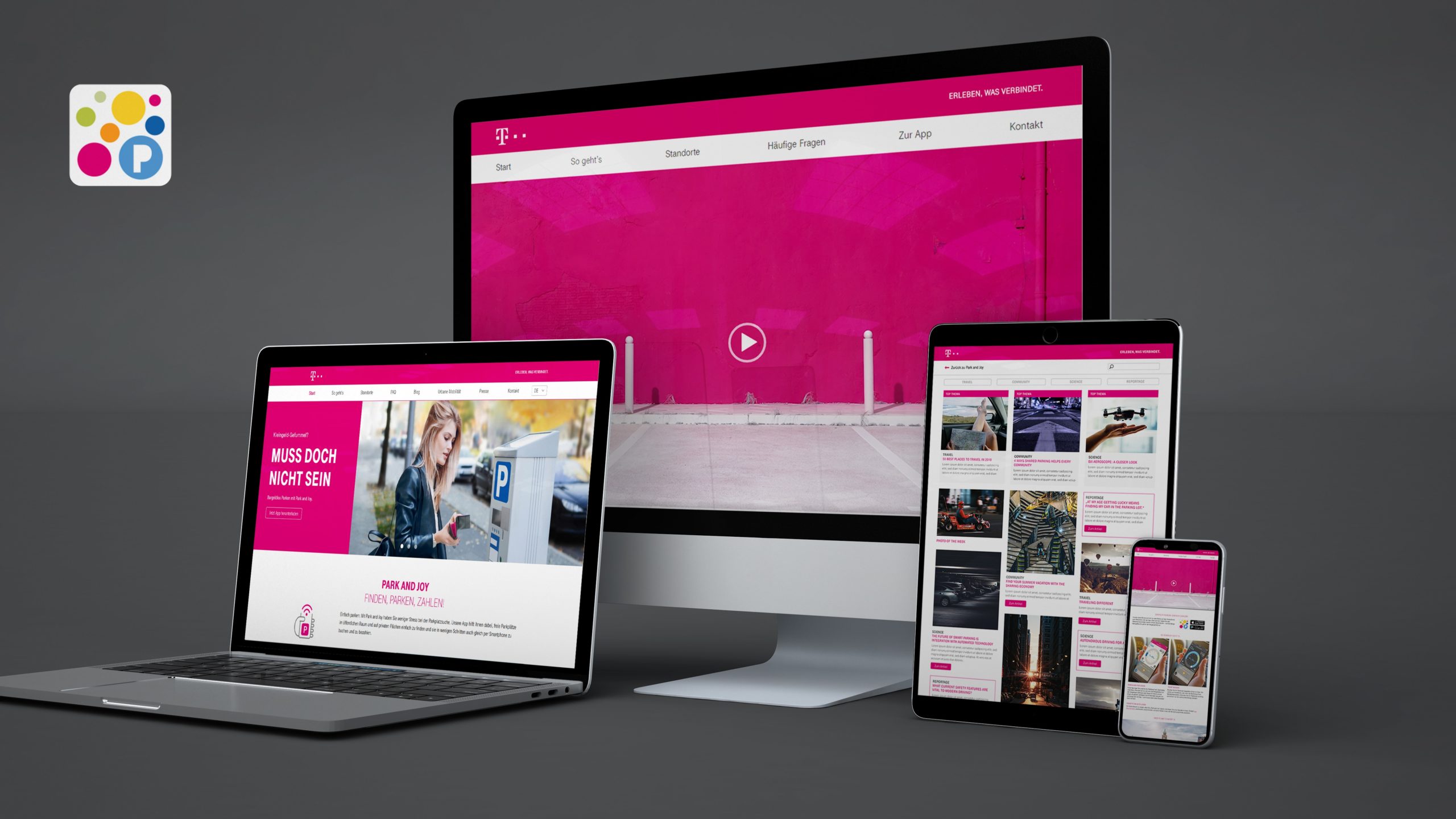
Park and JoyResponsive Design Webdesign
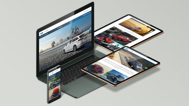
Ford Online Accessory CatalogueWebdesign, Shop design, Online Catalogue
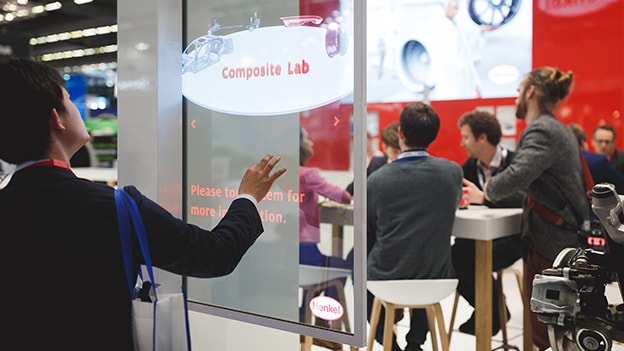
Henkel OLED JEC ExhibitionOLED interactive screen design, motion design
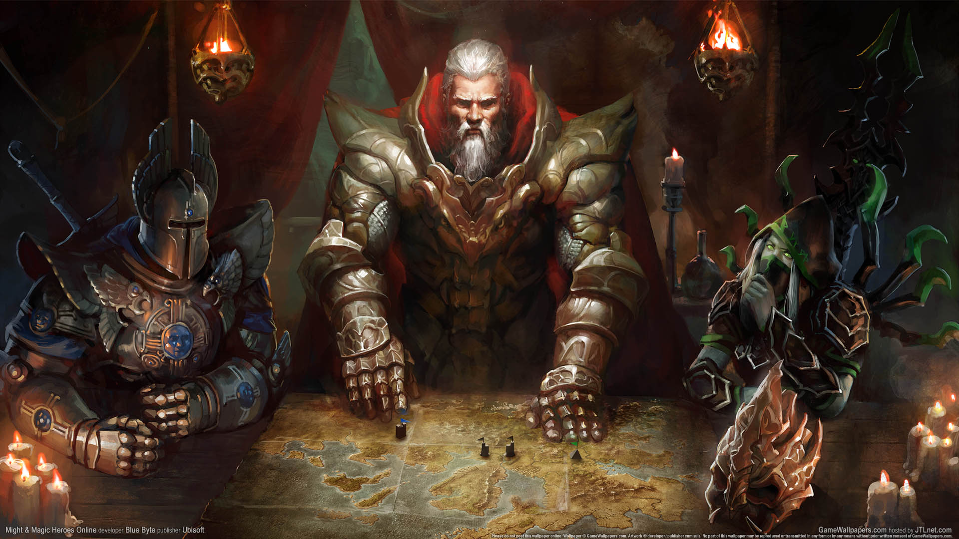
Might and Magic Heroes OnlineBrowser Game development User Experience Design
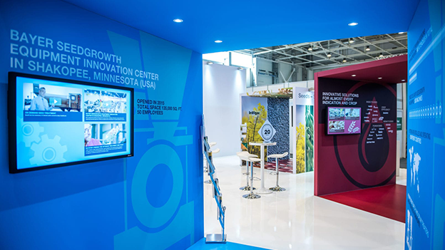
Bayer Crop Science – ISF Conference 2017Exhibition design

Skull and BonesGame Development User Interface Design

Palmer Hargreaves Website redesignResponsive Design Webdesign
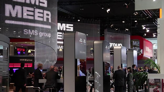
SMS Siemag LED animation Metec 2011Exhibition design

Bericht aus Berlin und WahldesignMotion Graphics